MES는 Manufacturing Execution System의 약자라지만 나한테는 욕의 약자처럼 느껴지는데..^^! 블로그니까 착한 말만 하기로 하자. 제조업이나 기계쪽은 관련 데이터셋을 찾기가 쉽지 않아 구글링하고 X100 또 하다가 그래도 한 번 해볼만한 데이터셋을 찾게 되었다. 캘리포니아에 사시는 김에버슨님이 작성해주신 자료이다. 깃의 주소는 여기로 간다. 김에버슨님이 작성한 글은 여기에서 본다.
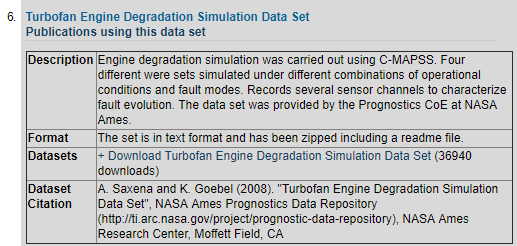
예제는 NASA에서 제공되는 Turbofan Engine Degradation Simulation data set으로 진행된다. 나사 홈페이지 가면 받을 수 있을 것처럼 보이지만 천만의 말씀 만만의 콩떡. URL이 소실된지 오래이므로 잘 검색해서 받아준다. 받아서 압축을 풀면 이런 문서가 있다. (물론 나사에서도 잘 찾아보면 있겠지)
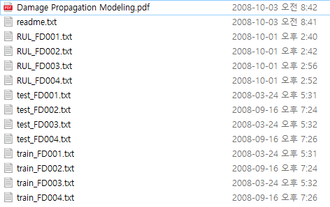
이것들을 각각 RUL, TEST, TRAIN.csv로 만들어야 하는데 직접 편집해도 되고 깃에 가서 저것들을 합치는 실행 파일을 실행해도 되고 지금 여기서 다운받아도 된다.
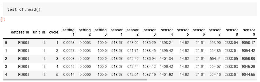
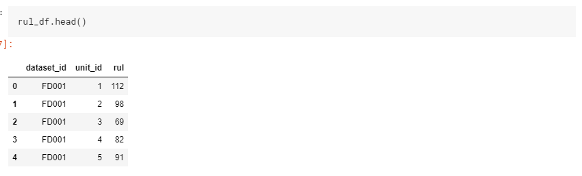
파일을 받으면 가장 먼저 할 일은 데이터를 확인하는 것이다. 나도 뭐 분석의 ㅂ자도 모르고 알고싶지도 않고 본업이라고도 생각 안하지만 책 읽는 마음으로 .head()를 열어본다. 나는 이제 환경 만드는 것도 귀찮고 노트북 켜는것도 귀찮아서 kaggle에서 진행했다.
import numpy as np
import pandas as pd
import matplotlib.pyplot as plt
%matplotlib inline
import os
print(os.listdir("../input"))
데이터의 리스트를 확인하고, csv를 dataframe으로 읽어 구조를 파악한다.
['RUL.csv', 'train.csv', 'test.csv']3개를 각각 넣어준다.
train_df = pd.read_csv('../input/train.csv')
test_df = pd.read_csv('../input/test.csv')
rul_df = pd.read_csv('../input/RUL.csv')

sensor_columns = [col for col in train_df.columns if col.startswith("sensor")]
setting_columns = [col for col in train_df.columns if col.startswith("setting")]
뭐 어떻게 넣어도 안이쁘구만? 구조를 좀 보자.
| Column | Description |
| dataset | dataset 이름 (파일) |
| unit_id | dataset 안에 유니크한 아이디값 |
| cycle | 엔진이 작동한 이후 (전원 넣은 이후?) 얼마나 돌았는지 |
| setting 1 - 3 | 뭐 세팅값인가보다 |
| sensor 1 - 21 | 뭐 센서값인가보다 |
| rul | 기기의 남은 수명(RUL 파일에만 존재) |
대충 구조를 알아냈으면 단일 값들을 좀 알아보자
Visualize A Single Engine's Sensor Readings
example_slice = train_df[(train_df.dataset_id == 'FD001') & (train_df.unit_id == 1)]

fig, axes = plt.subplots(7, 3, figsize=(15, 10), sharex=True)

for index, ax in enumerate(axes.ravel()):
    sensor_col = sensor_columns[index]
    example_slice.plot(x='cycle',y=sensor_col, ax=ax, color='black')

    if index % 3 == 0:
        ax.set_ylabel("Sensor Value", size=10)
    else:
        ax.set_ylabel("")

    ax.set_xlabel("Time (Cycles)")
    ax.set_title(sensor_col.title(), size=14)
    ax.legend_.remove()

fig.suptitle("Sensor Traces : Unit 1, Dataset 1", size=20, y=1.025)
fig.tight_layout()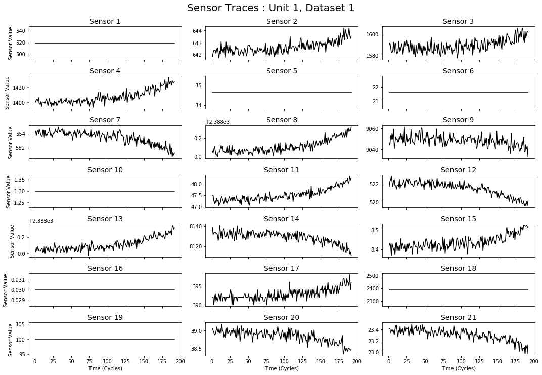
평온보스인 친구들이 있고 이리저리 움직이는 애들이 있다. dataset1의 unit1이니 다른 애들이 얼마나 많을지 감이 안잡힌다. 데이터는 시계열 형태(cycle이 시간이니)이므로 시간상의 변화라고 이해하면 될 듯 하다. 보고나면 이제 다른 걸로도 함 봐야지. 센서는 모두 다른 값을 가지고 있으므로 랜덤하게 10개를 골라 센서의 판독값을 시각화해본다.
Visualize Multiple Engines' Sensor Readings
그러기 전에 그리려는 애를 파악해보자. 얘는 dataset_id 1번(FD001) unit_id 별로 랜덤한 값 10개를 뽑아온다.
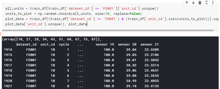
all_units = train_df[train_df['dataset_id'] == 'FD001']['unit_id'].unique()
units_to_plot = np.random.choice(all_units, size=10, replace=False)
plot_data = train_df[(train_df['dataset_id'] == 'FD001') & (train_df['unit_id'].isin(units_to_plot))].copy()
plot_data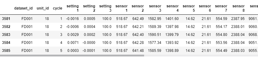
여기서 pd.isin은 isin는 괄호 안에 가져오고 싶은 value를 호출하여 가져온다.
for index, ax in enumerate(axes.ravel()):
    sensor_col = sensor_columns[index]
    for unit_id, group in plot_data.groupby('unit_id'):
        print(group.head())
axes.ravel은 밀대로 밀어주는 역할을 한다. 많이 써봤겠지만 2*2 행렬에 ravel을 하면 1*4가 된다.
fig, axes = plt.subplots(7, 3, figsize=(15, 10), sharex=True)
for index, ax in enumerate(axes.ravel()):
sensor_col = sensor_columns[index]
for unit_id, group in plot_data.groupby('unit_id'):
temp = group.drop(['dataset_id'],axis=1)
(temp.plot(x='cycle', y=sensor_col, alpha=0.45, ax=ax, color='gray', legend=False))
(temp.rolling(window=10, on='cycle').mean().plot(x='cycle', y=sensor_col, alpha=.75, ax=ax, color='black', legend=False));
if index % 3 == 0:
ax.set_ylabel('Sensor Value', size=10)
else:
ax.set_ylabel('')
ax.set_title(sensor_col.title())
ax.set_xlabel('Time (Cycles)')
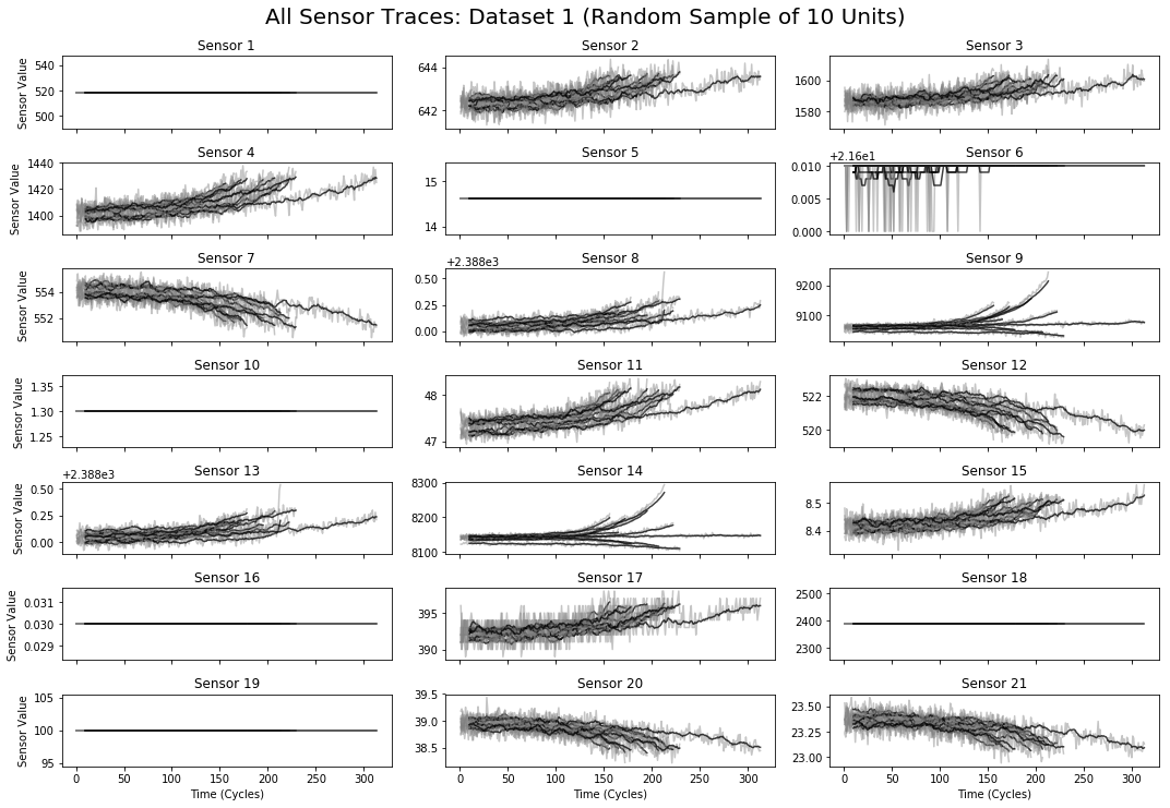
fig.suptitle('All Sensor Traces: Dataset 1 (Random Sample of 10 Units)', size=20, y=1.025)
fig.tight_layout()중간에 dataset_id에 string값이여서 rolling 못한다고 울길래 지워줬다. 원문은 그대로 진행하던데 아마 파이썬 버전이나 라이브러리 버전 차이때문에 그런듯. 결과는 동일하게 나왔다.
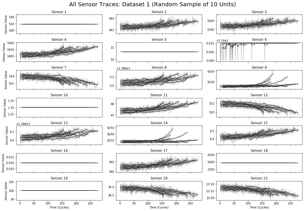
뭘 표현하려하는지도 모르겠고 잘 구분도 안간다. 표를 나눠서 다시 본다.
fig, axes = plt.subplots(7, 3, figsize=(15, 10), sharex=True)
for index, ax in enumerate(axes.ravel()):
    sensor_col = sensor_columns[index]
    for unit_id, group in plot_data.groupby('unit_id'):
        temp = group.drop(['dataset_id'],axis=1)
        (temp.plot(x='cycle', y=sensor_col, alpha=0.45, ax=ax, color='gray', legend=False))
    if index % 3 == 0:
        ax.set_ylabel('Sensor Value', size=10)
    else:
        ax.set_ylabel('')
    ax.set_title(sensor_col.title())
    ax.set_xlabel('Time (Cycles)')
fig.suptitle('All Sensor Traces: Dataset 1 (Random Sample of 10 Units)', size=20, y=1.025)
fig.tight_layout()
all_units = 선택한 data_set에서 유닛~뭐 있는지 (distinct units_name이랑 같음) 보고 plot_data에 랜덤 유닛 뽑아서 밀어넣어 준 것이다. 이걸보면 금방 알 수 있다.
10개의 랜덤한 unit id를 가진 칭쿠들의 데이터를 가지고 있는 것이다. 그러니까 랜덤 유닛의 전체 주기를 그래프로 그려주고 있는 것이다.
fig, axes = plt.subplots(7, 3, figsize=(15, 10), sharex=True)
for index, ax in enumerate(axes.ravel()):
    sensor_col = sensor_columns[index]
    for unit_id, group in plot_data.groupby('unit_id'):
        temp = group.drop(['dataset_id'],axis=1)
        (temp.rolling(window=10, on='cycle').mean().plot(x='cycle', y=sensor_col, alpha=.75, ax=ax, color='black', legend=False));
    if index % 3 == 0:
        ax.set_ylabel('Sensor Value', size=10)
    else:
        ax.set_ylabel('')
    ax.set_title(sensor_col.title())
    ax.set_xlabel('Time (Cycles)')
fig.suptitle('All Sensor Traces: Dataset 1 (Random Sample of 10 Units)', size=20, y=1.025)
fig.tight_layout()
얘는 rolling를 썼는데 rolling이 무엇인지 먼저 생각해봐야한다. 미역 줄기같이 생겼지만 정해진 규칙을 통해 이전값과 계산해 주는 것이다. 얘는 window = 10, cycle인데 시계열 데이터이기 때문에 이렇게 한 것 같다. 이 그림 보면 이해가 빠르다.

mean()값을 계산한 것이므로 이전 값의 평균들을 수치화시켜준 것이다. 다시 그래프를 보면 window의 개수만큼 롤링그래프는 뒤에 있다는 것을 알게 된다.
Normalize Sensor Traces To End At The Same Time
정규화 하나보다.
def cycles_until_failure(r, lifetimes):
    return r['cycle'] - lifetimes.ix[(r['dataset_id'], r['unit_id'])]
Visualize The Failure Modes of Sensors, Using Normalized Traces Created Above
lifetimes = train_df.groupby(['dataset_id','unit_id'])['cycle'].max()
plot_data['ctf'] = plot_data.apply(lambda r: cycles_until_failure(r, lifetimes), axis=1)

fig, axes = plt.subplots(7,3, figsize=(15,10), sharex = True)
for index, ax in enumerate(axes.ravel()):
    sensor_col = sensor_columns[index]
    for unit_id, group in plot_data.groupby('unit_id'):
        temp = group.drop(['dataset_id'],axis=1)
        (temp.plot(x='ctf', y=sensor_col, alpha=0.45, ax=ax, color='gray', legend=False))
        (temp.rolling(window=10,on='ctf').mean().plot(x='ctf',y=sensor_col, alpha=.75, ax=ax, color='black',legend=False))
    if index % 3 == 0:
        ax.set_ylabel("Sensor Value", size=10)
    else:
        ax.set_ylabel("")
    ax.set_title(sensor_col.title())
    ax.set_xlabel('Time Before Failure (Cycles)')
    ax.axvline(x=0, color='r', linewidth=3)
    ax.set_xlim([None,10])
fig.suptitle("All Sensor Traces: Dataset 1 (Random Sample of 10 Units)", size=20, y=1.025)
fig.tight_layout()
오류값을 찾아내기 위해 엔진이 언제 멈출지 표시한다. 모두 0이 되는 순간에 끝난다는 것을 알 수 있다. 이 때에 데이터를 보면 의심스러운 점이 있는데 지속적으로 상승, 하강의 값을 보여주기도 하고 그냥 단순히 멈추기도 한다는 것이다. 이렇게 보면 train 데이터는 어지간히 본 것이다. test 세트는 다음과 같은 구조로 되어있다.
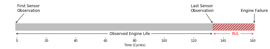
데이터의 시작 지점은 알고 있지만 중간에 수집이 끊긴 형태이기 때문에 언제 멈출지 모른다. 이전의 결과를 바탕으로 언제 끝나는지에 대해 알아야 한다. 또한 멈추기 이전에 결과로 예측하는 것과 멈춘 이후를 예측하는 것은 결과 비용이 다르다. 예를 들어 비행기가 이른 정비를 하게 되어 비용이 낭비되는 것과 늦은 정비를 받게 되어 사고가 일어나는 것은 범위부터가 다르다. 때문에 평가또한 정확하게 되어야 한다. 다음에는 직접 RUL을 예측하는 것에 접근해본다.
'Python > Default' 카테고리의 다른 글
| yaml 파일 요소 뽑아내기 (0) | 2019.11.15 |
|---|---|
| Kaggle에서 한글 폰트 사용하기 (0) | 2019.07.12 |
| Python 교육 1일차 (0) | 2019.05.30 |
| Python PDF extract tool 정리 (0) | 2019.05.29 |
| Pyspc를 사용하여 SPC Graph 그리기 (0) | 2019.05.10 |

